Col Gowers Homes
branding + visual identity
- Brand identity
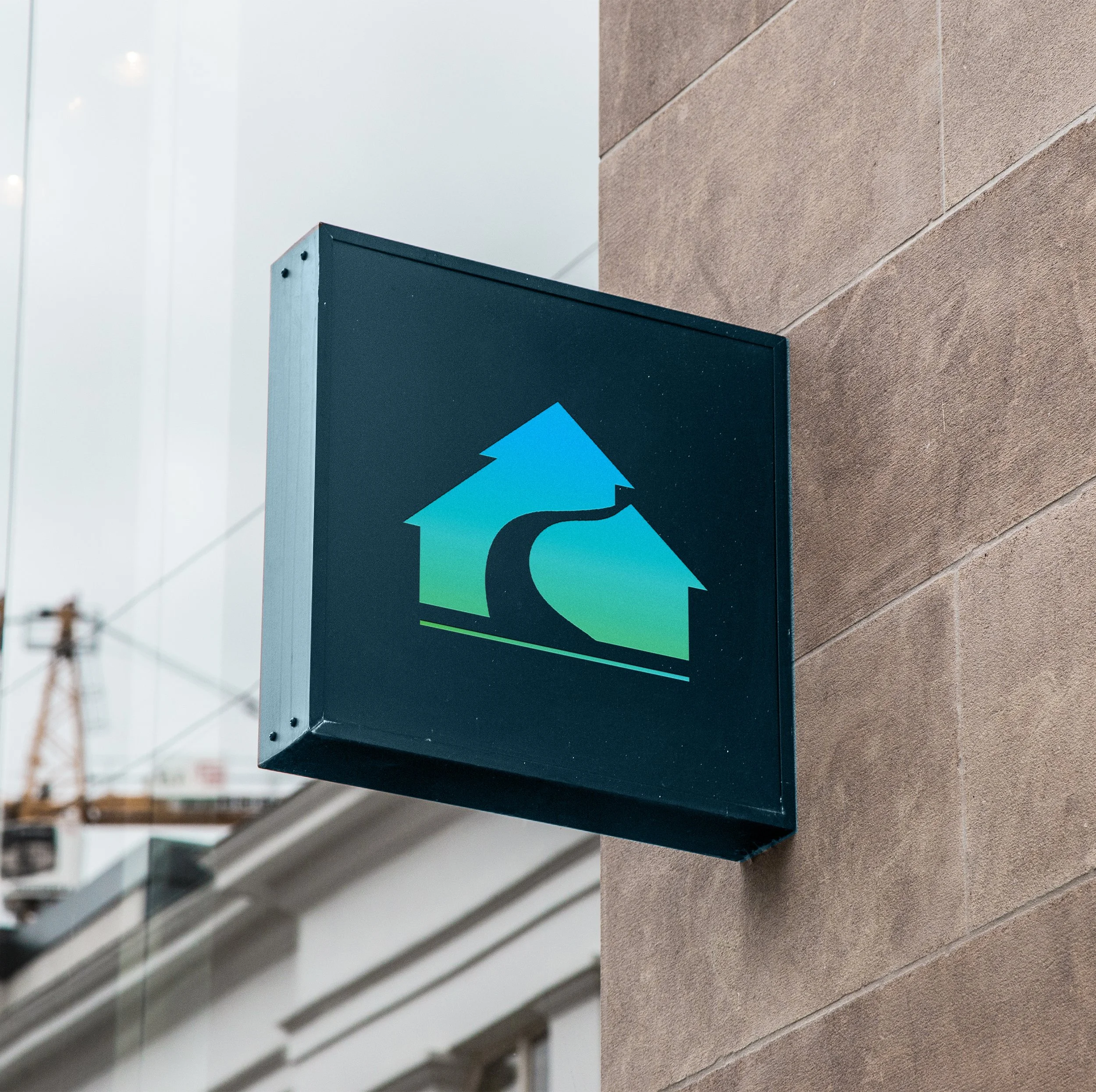
- Updated logo
- Visual identity
- Colour palette
- Tagline
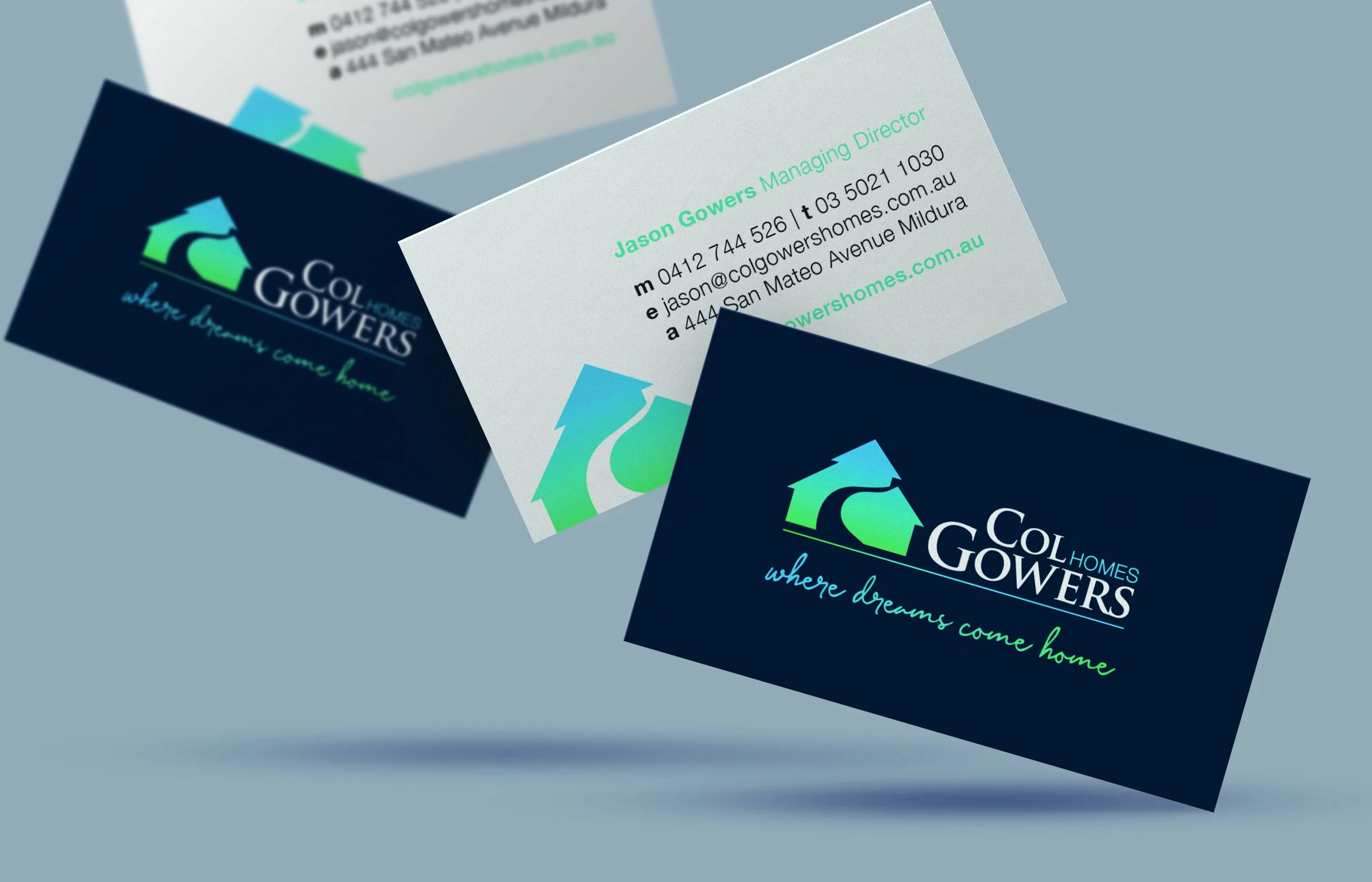
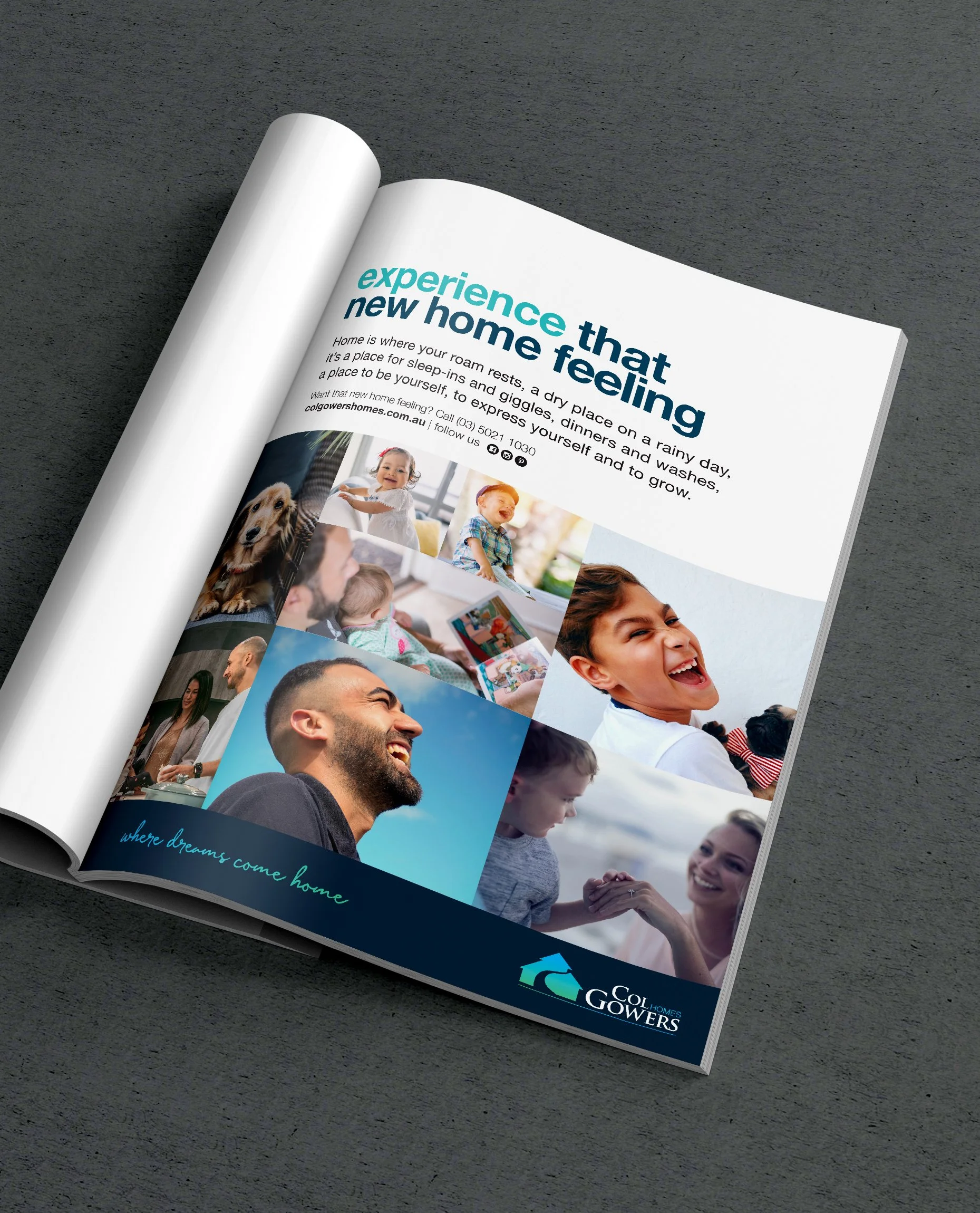
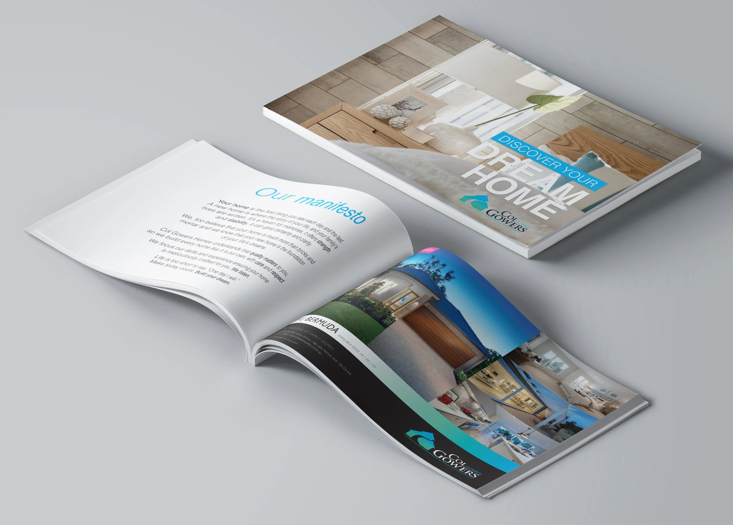
- Brochures and stationery
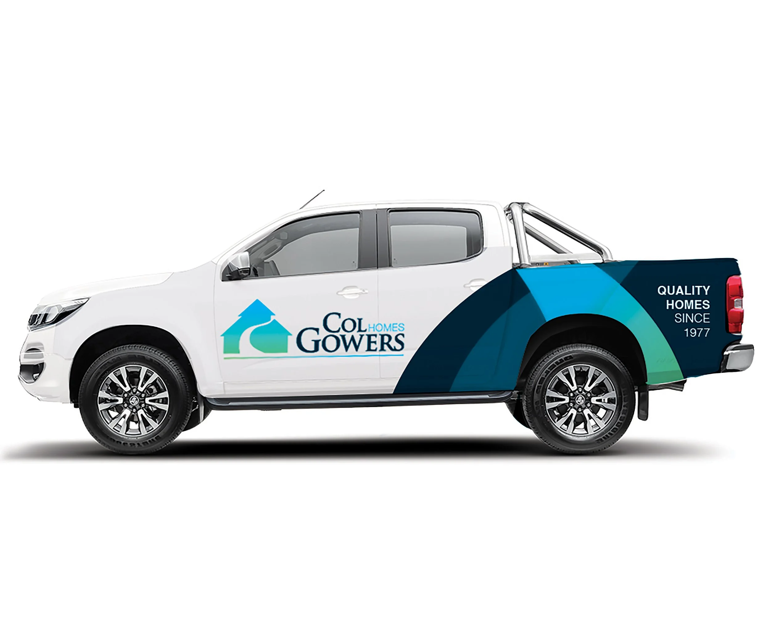
- Livery
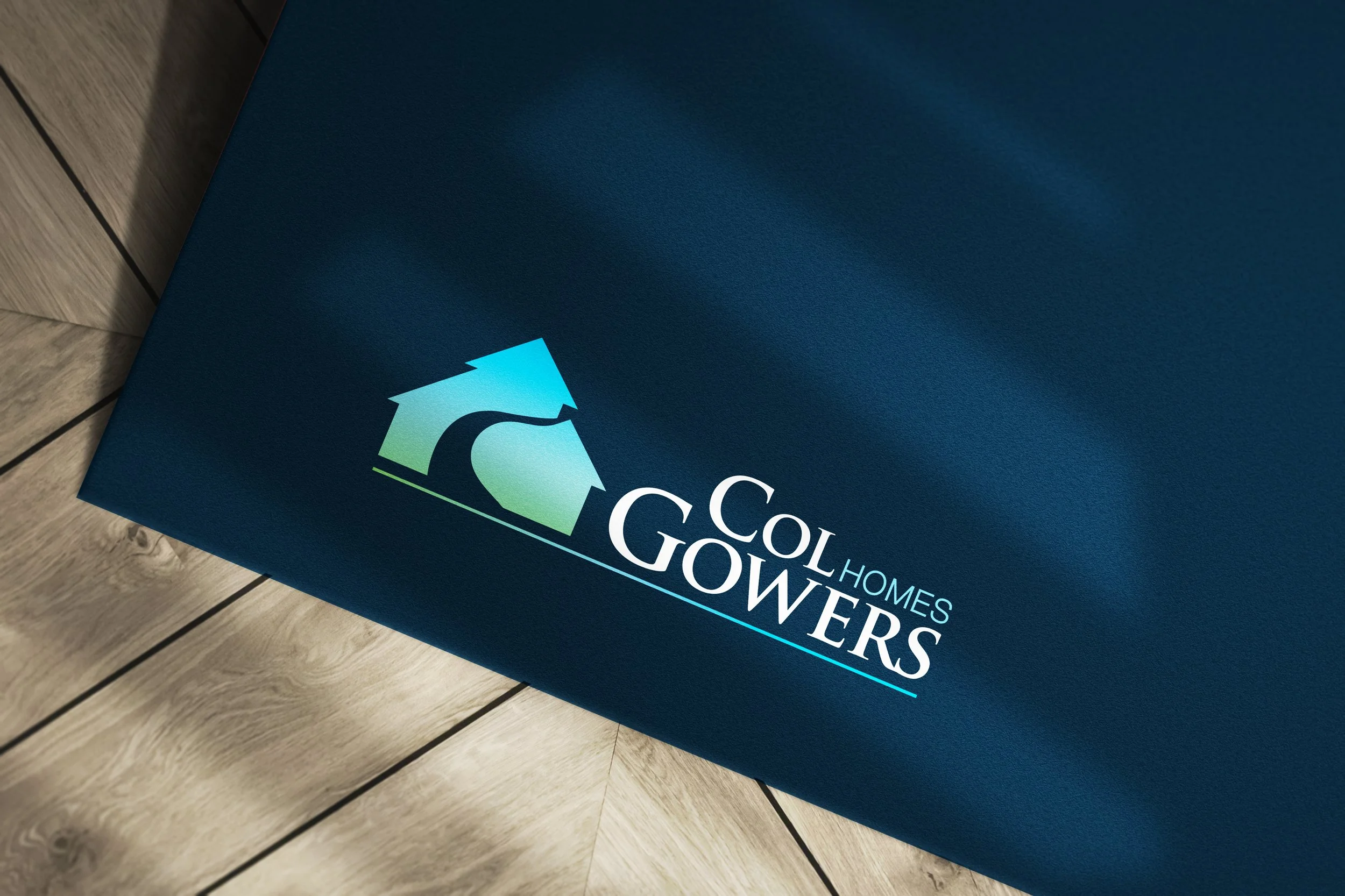
KND have worked with Col Gowers Homes since their initial rebrand in 2003. In 2020 we expanded the original brand to include a more varied colour palette and include a tagline for their company.
The branding added green and teal to the suite of brand colours, in addition to the bright blue they had been known for. This ensured that CGH had a unique colour palette regionally. The green represented new growth and a change in the industry towards more sustainable building practices.
Green represents growth, calm and change.
As part of the refresh we evolved their brochures, ad designs, brand identity and livery.
2003 - present // Client website